Welcome to Our Identity Guide
The Mt. San Antonio College Identity Guide is an essential resource to ensure consistency in how our college is represented. It provides design and brand tools, such as logos, color schemes, and typography. When applied consistently, these elements make our stories, webpages, and materials more unified, meaningful and memorable. If you have any questions, contact the Office of Marketing & Communication.
Mt. SAC Logo and Seal
The Mt. San Antonio College logo and seal are visual representations of the college and are copyright protected. They are subject to specific rules to maintain consistency and integrity, as well as protect the college's brand, reputation and rights. By consistently using the approved logo and seal in the correct contexts, we reinforce our institution's brand and ensure a unified and recognizable presence that reflects the values and quality of the college.
IMPORTANT: The logo and seal may only be used in their approved forms. Any alterations or distortions of the logo and seal are strictly prohibited. The college takes seriously any alteration, unauthorized use, and/or misrepresentation of its logo and seal. Proper clearances and minimum size requirements should be adhered to, and the logo should never be placed on a busy or conflicting background. Their usage is managed by the Marketing & Communication Office.
- Alterations are not permitted: These marks may not be altered and warped. Colors may not be substituted.
- Athletic marks: These marks can only be used by the Athletics Division.
- Resale limitation: Mt. SAC entities may use these authorized graphics. However, any request to use these for resale must be approved by Mt. SAC Marketing and the Foundation.
- Restrictions: College marks may not be used on products related to tobacco, alcohol, or sexually
explicit materials.
Mt. SAC Logo

The Mt. San Antonio College logo includes our monogram (Mt. SAC), wordmark (Mt. San Antonio College), namesake mountain, and torch, which represents enlightenment, passion and resilience. The Mt. San Antonio College logo should be used for all official college business and communications, both in print and digital formats, to establish a consistent and professional visual identity. This includes, but is not limited to, the college's marketing materials, official documents, websites, social media, signage, and any materials that represent the college to the public.
Clear space and minimum size requirements must be observed to ensure the logo's legibility and impact. The logo should be a minimum of 1.25" wide, though there are some occasions and formats where it may be printed smaller. The logo should have a minimum clearance space of one-ninth the width of the graphic, or about the width of the "Mt." in the wordmark. For special needs or considerations, contact the Marketing & Communication Office.
Mt. SAC Seal
 The college seal is a formal emblem and should be reserved for official and ceremonial
purposes, such as diplomas, official documents, and formal institutional communications.
When using the seal, it is essential to maintain its integrity and not alter its design,
colors, or proportions in any way. The key distinction between the college seal and
the college logo lies in their respective purposes and formality. The college logo
is designed for everyday use in a wide range of communications, while the college
seal is a more formal emblem reserved for specific official and ceremonial contexts.
Understanding and respecting these differences is vital to maintain the consistency
and appropriate representation of Mt. San Antonio College's visual identity across
various applications.
Clear space and minimum size requirements must be observed to ensure the seal's legibility and impact. The seal should be a minimum of 1" wide, though there are some occasions and formats where it may be printed smaller. The seal should have a minimum clearance space of one-ninth the width of the graphic, or about the distance between the outer ring and inner ring. For special needs or considerations, contact the Marketing & Communication Office.
- Solid Black (jpg)
Mt. SAC Athletics Logo
The athletics logo is an important and distinct part of our identity. While the college logo represents the broader institutional identity, the athletics logo focuses on the unique identity of the college's athletic programs and teams. The athletics logo is primarily used in the context of sports and related activities, such as team uniforms, sports merchandise, and promotional materials for athletic events. It does not replace the college logo in academic and administrative contexts. Using the appropriate logo for each context ensures clarity and maintains the integrity of our brand identity across all aspects of Mt. San Antonio College. Contact the Athletics Division for permission to use this mark.
- Athletics Logo Usage and Style Sheet
- Full Color (jpg)
Mascot and Spirit Marks
The college's new costumed mascot and college spirit marks are designed to foster school spirit and unity. College spirit marks are visual symbols or graphics used by colleges to promote school spirit and loyalty, particularly in non-academic contexts. Unlike the primary college logo, which represents the institution as a whole, spirit marks are used in less formal settings to build and encourage a sense of community and pride among students, alumni, and fans.
IMPORTANT: These marks can be featured on official college merchandise, promotional material and in communications. They help reinforce our institutional identity and support a cohesive brand.
- Alterations are not permitted: These marks may not be altered and warped. Colors may not be substituted.
- Athletic marks: These marks can only be used by the Athletics Division.
- Resale limitation: Use of these marks for resale or for profit must be approved by Mt. SAC Marketing.
- Restrictions: College marks may not be used on products related to tobacco, alcohol, or sexually
explicit materials.
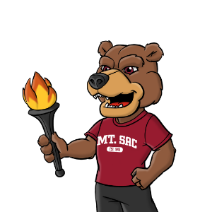
Mascot: Rizzly the Grizzly 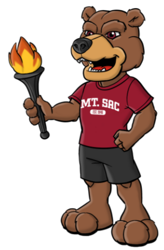
Our costumed mascot Rizzly the Grizzly was developed after a comprehensive campus-wide process. Inspired by the grizzly bears once native to our namesake mountain, Rizzly embodies the qualities of strength, intelligence, and confidence. Just as the grizzly navigates the wilderness with astonishing perseverance and determination, Mounties approach their academic and personal journeys with the same spirit. Explore the campus-wide process of developing the mascot at www.mtsac.edu/mascot.
Clear space and minimum size requirements must be observed to ensure the mark's legibility and impact. It should be a minimum of 1.5" tall, though there are some occasions and formats where it may be printed smaller. It should have a minimum clearance space of about the letter M on the t-shirt. For special needs or considerations, contact the Marketing & Communication Office.
- Full Color Mascot with Torch (jpg, png)
- Full Color Mascot with Thumbs Up (jpg, png)
- Full Color Mascot with Wave (jpg, png)
- Full Color Mascot with Sign (jpg, png)
College Spirit Mark: Grizzly
Representing Mounties, this grizzly embodies the qualities of strength, intelligence and confidence. Just as the grizzly navigates the wilderness with astonishing perseverance and determination, Mounties approach their academic and personal journeys with the same spirit. College spirit marks are visual symbols or graphics used by colleges to promote school spirit and loyalty, particularly in non-academic contexts. Unlike the primary university logo, which represents the institution as a whole, spirit marks are used in less formal settings to build and encourage a sense of community and pride among students, alumni, and fans.
Clear space and minimum size requirements must be observed to ensure the mark's legibility and impact. It should be a minimum of 1.5" wide, though there are some occasions and formats where it may be printed smaller. It should have a minimum clearance space of about the width of the bear's left ear. For special needs or considerations, contact the Marketing & Communication Office.
College Spirit Mark: Block Letters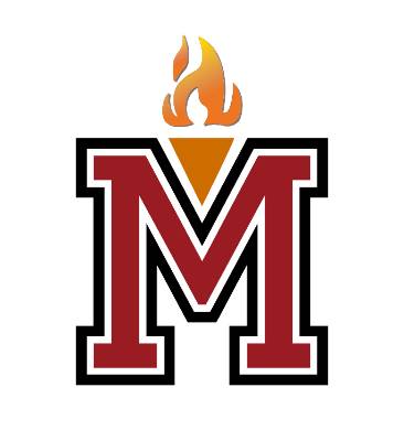
These varsity block letters provide marks to represent the quintessential college experience. The Block M incorporates the college's torch, which is seen in the logo. The torch symbolizes knowledge, enlightenment, and education. It signifies the college's mission to foster learning and illuminate the path for students toward achieving their academic and professional goals. College spirit marks are visual symbols or graphics used by to promote school spirit and loyalty, particularly in non-academic contexts. They are often associated with sports, student clubs, and other informal or extracurricular activities. Unlike the primary university logo, which represents the institution as a whole, spirit marks are used in less formal settings to build and encourage a sense of community and pride among students, alumni, and fans.
Clear space and minimum size requirements must be observed to ensure the mark's legibility and impact. It should be a minimum of 1" wide, though there are some occasions and formats where it may be printed smaller. It should have a minimum clearance space of about the height of the serif. For special needs or considerations, contact the Marketing & Communication Office.
- Block M (png, jpg, tif)
- Block Mt. SAC (black: png, jpg, tif; red: png, jpg, tif)
- Block Mounties (black: png, jpg, tif; red: png, jpg, tif)
- Block Rizzly (black: png, jpg, tif; red: png, jpg, tif)
College Spirit Mark: Torch
As seen in the Mt. SAC logo, the torch symbolizes knowledge, enlightenment, and education. It signifies the college's mission to foster learning and illuminate the path for students toward achieving their academic and professional goals. College spirit marks are visual symbols or graphics used by colleges to promote school spirit and loyalty, particularly in non-academic contexts. They are often associated with sports, student clubs, and other informal or extracurricular activities. Unlike the primary university logo, which represents the institution as a whole, spirit marks are used in less formal settings to build and encourage a sense of community and pride among students, alumni, and fans.
Clear space and minimum size requirements must be observed to ensure the mark's legibility and impact. It should be a minimum of 1" wide, though there are some occasions and formats where it may be printed smaller. It should have a minimum clearance space of about the distance between the torch holder and the black circle. For special needs or considerations, contact the Marketing & Communication Office.
Athletics Spirit Mark
The Athletics spirit mark is only for use by the Athletics division. Representing Mounties Athletics, this grizzly bear embodies the strength, fearlessness, and bold determination of our dominating Athletics teams. Spirit marks are visual symbols or graphics used by colleges to promote school spirit and loyalty, particularly in non-academic contexts. They are often associated with sports, student clubs, and other informal or extracurricular activities. Unlike the primary university logo, which represents the institution as a whole, spirit marks are used in less formal settings to build and encourage a sense of community and pride among students, alumni, and fans.
Clear space and minimum size requirements must be observed to ensure the mark's legibility and impact. It should be a minimum of 1" wide, though there are some occasions and formats where it may be printed smaller. It should have a minimum clearance space of about the width of the Athletics Grizzly's left ear. For special needs or considerations, contact the Marketing & Communication Office or Athletics Division.
- Athletics Grizzly (png)
- Athletics Grizzly with Mounties wordmark (png)
- Athletics Grizzly with Athletics Logo (png)
- Athletics arched Mt. SAC workmark (png)
Mt. SAC Colors
Imagine the bold morning sunrise behind our namesake mountain. That's what inspires our college's strong and vibrant colors. The official colors are a powerful and essential brand element that create a consistent identity across all communications and applications.
Mt. SAC's colors use specific PMS, CMYK, RGB and HEX formulas to create consistent colors across all channels and media. Primary importance is also given to good contrast for legibility and accessibility. For print projects, use PMS or CMYK. For digital and web projects, use RGB and HEX.
Mt. SAC Maroon
Used in the college logo, Mt. SAC Maroon is a deep, rich red. The visually striking color has richness and depth while also conveying warmth and energy.
 |
Mt. SAC Maroon |
Logo Colors
These colors are also found in the logo's Flame, Torch Handle, and Mountains.
 |
 |
 |
 |
| Flame Gold: PMS 135 C C 0 | M 20 | Y 75 | K 0 R 225 | G 205 | B 91 Hex: ffcd5b |
Flame Orange PMS 158 C C 0 | M 60 | Y 90 | K 0 R 245 | G 130 | B 50 Hex: f58232 |
Sienna Brown: PMS 1605 C C 25 | M 73 | Y 100 | K 15 R 168 | G 86 | B 35 Hex: a85623 |
Rich Black: PMS Black 6 C C 50 | M 30 | Y 30 | K 100 R 0 | G 0 | B 8 Hex: 000008 |
Secondary Colors
These secondary colors are designed to pair well with the logo colors and are inspired by the color of mountains in the distance. Designers can explore shades and tints or lighten and darken these colors to find the right fit for the piece.
 |
 |
 |
 |
| Light Mountain Blue: PMS 653 C C 87 | M 64 | Y 11 | K 3 R 50 | G 97 | B 149 Hex: 326195 |
Deep Mountain Blue: PMS 5255 C C 93 | M 85 | Y 51 | K 66 R 11 | G 18 | B 44 Hex: 0b122c |
Light Mountain Gray: PMS Cool Gray 7 C C 43 | M 35 | Y 34 | K 1 R 52 | G 153 | B 155 Hex: 97999b |
Charcoal Mountain: PMS 7540 C C 69 | M 59 | Y 52 | K 33 R 74 | G 79 | B 85 Hex: 4a4f55 |
Mt. SAC Typography
Mt. SAC uses families of typefaces that work together to bring the college's story to life. Our brand typefaces may not always be available to everyone for use in Word documents, PowerPoint presentations and other digital applications. In those instances, alternative system font options are provided.
Futura
Common Alternative: Avenir Next or Segoe
Futura is the college's primary typeface. It is a timeless and versatile typeface known for its geometric design and modern appearance. Its clean and simple aesthetic has made it a staple in design. It's used in our logo and best used for bold headings and areas that call for attention. If Futura is not available, Avenir Next and Segoe are acceptable alternatives that are readily available in system fonts.
Source Sans
Common Alternative: Calibri or Arial
Source Sans is a readily available Google font for download. It is known for its balanced design, making it easy to read in print and online. Source Sans is available in various weights and styles making it suitable for a wide range of uses, from headings to paragraph content. If Source Sans is not available, Calibri is an acceptable alternative that is readily available in system fonts.
Source Serif
Common Alternative: Georgia or Cambria
Source Serif is a readily available Google font for download. It is a classic and elegant serif font, known for its readability and timeless design. Source Serif is often used to draw contrast with the Source Sans Pro or provide a more traditional feel. It is easy to read in print and online. If Source Serif is not available, Georgia and Cambria are acceptable alternatives that are readily available in system fonts.

