Web Accessibility Checklist
The Web Accessibility Checklist is a how-to guide for creating accessibility compliant web pages. By following all parts of the checklist as outlined, your department webpages will be better processed by screen readers and other assistive devices.
-
- 1Title
Each web page needs to have a unique and meaningful name that distinguishes it from others on the website. Files added to the web page must also have unique names. For example, “Department Guidelines and Procedures for Student Employees” versus “10817234137.docx”
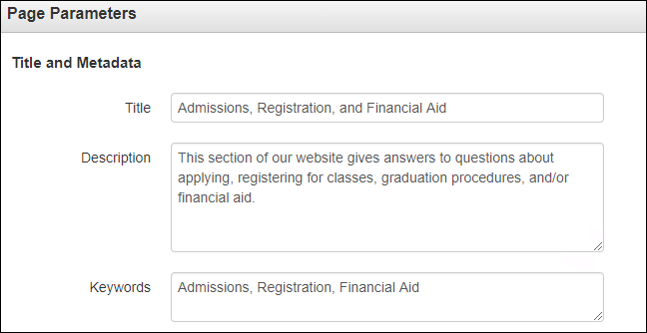
To add a Title and Description to your webpage.
- Navigate to your page within OmniUpdate.
- Click the light bulb to Check Out the page.
- Click Properties.
- Enter a descriptive and unique page Title.*
- Enter a Description and Keywords.
- Save and Publish.
*Make your page title unique by adding your department or program at the beginning of your page title (e.g., "Financial Aid Frequently Asked Questions | Mt. SAC" is much better than just "Frequently Asked Questions").

- 2Images
Images that provide unique information for the user must include alternative text (alt text) that briefly summarizes the contextual purpose of the image. This will be read to people using screen readers. The screen reader will automatically state "image of" before the alt text, so the alt text should not include this information. Images purely for decoration/that do not include information can be checked as "decorative."
To add Alternative Text to Images:
- Navigate to your page in OmniUpdate
- Click the light bulb to Check out the page
- Click the Edit button for regions with images
- Click the image to select it
- Click the Insert/Edit button
- Enter a meaningful Alternative Description
- Save and Publish
- 3Links
Links should be placed atop text that uniquely describes the specific location where the link will take the viewer.
For example, place a link atop text “Annual Report to the Community." Do not place URL links directly on the page or place them on generic text such as “click here.”
- Make link names that are unique and meaningful.
- Make sure the words clearly describe where the will go.
- Use a short description. Only place the link over the few words that describe the link location.
- Avoid phrases like "Click Here."
- Test links to make sure they go to the desired place.
- Only link to a single, specific location once on a single web page.
- 4Audio/Videos
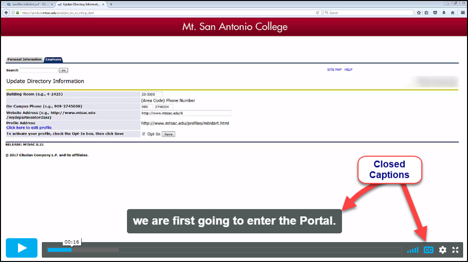
Make sure audio files have transcriptions and videos have captions. Please see the Accessible Video page to access captioning and transcription services.
To test videos for captions:
- Find and click the CC button to confirm the video is captioned.
- Make sure the captions are at least 99% accurate, including proper punctuation and capitalization.
- Captions should also include "audio description" of any non-word sounds ("[horn honking]" is an example).

- 5Navigation
Webpage users must be able to logically navigate electronic media without the use of a mouse.
- Make sure you can navigate your page using the tab key.
- Make sure the navigation is logical and sequential.

- 6Forms
Users must be able to logically navigate forms without the use of a mouse.
-
Confirm a press of the Tab key takes you to the next logical entry spot on the form
-
If a form label is clicked, confirm the cursor appears in the form field.
-
- 7Headings
All headings should be styled using the Heading 1- Heading 6 styles. Headings and subheadings must follow a logical, top-down, sequential order.
- There should be one Heading 1 at the top of the page followed by Heading 2 and so on.
- 8Tables
If possible, avoid the use of tables. Do not use tables for design purposes. When tables are used, include text in every cell. Mark table header rows and columns in the properties.
- Do not use tables for formatting only.
- Do not use nested tables or nested columns.
- Keep each table to one page if possible.
- 9Color
Color must not be the sole method for providing information or emphasis. For example, changing the color of text to green or red to designate if the item is active or inactive is not compliant. Use a secondary way to indicate emphasis or meaning.
- Color should be combined with other formatting such as bold or italics to emphasize information.
- If you use color, it must be high contrast (i.e., dark text on light background or vice-versa).
- Check for a color contrast of at least 4/5:1 between the text and background by using a color contrast analyzer such as the WebAIM Color Contrast Checker.
- 1Title


